Kick street Collective
Step by Step: Redesigning the Sneaker Shopping Experience

Introducing the mobile shopping app created for Kick Street Collective, a one-stop destination for sneaker enthusiasts.
Timeline
From research to final designs in 6 weeks
Background
The goal of this project during Google's UX Design course was to design and develop a user-friendly mobile shopping app for Kick Street Collective to provide a seamless and enjoyable shopping experience for its users.
This project was undertaken independently, where I took complete ownership of tasks ranging from user research, user flows, information architecture, wireframes, and Lo-Fi/Hi-Fi prototyping, among other essential components.
This category details the step-by-step approach taken during the project which follows the phases of a Google design sprint.
Empathize, Define, & Ideate
Empathized with users by conducting interviews to understand their needs and pain points, which uncovered that users prioritize personalization, clear product details, and an intuitive checkout process when it comes to shopping for sneakers online.
From this, I created personas Jane & John to build a clear picture of the target audience, what they need, how they behave, and the challenges they face.


Design & Develop
Based on the insights gathered, I designed information architecture, user stories, user flows, and wireframes focused on addressing their frustrations and enhancing their shopping journey, resulting in an app that feels intuitive, efficient, and enjoyable.


Prototype
I created multiple low and high-fidelity prototypes to provide an interactive representation of the final product. These crucial steps allowed me to refine and optimize the user experience
Testing & Optimization
I conducted user testing with 5 users. During these usability studies, users ages 20-55 provided feedback from which I was able to gain valuable insights into several areas of improvement that were addressed. While the app already provided a solid foundation, refining personalization, improving transparency, and simplifying navigation will enhance the overall shopping experience.
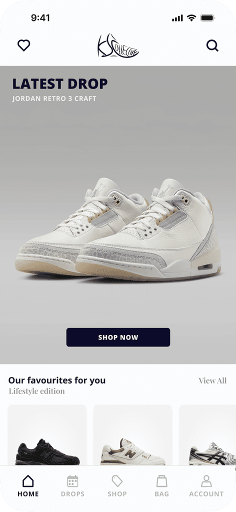
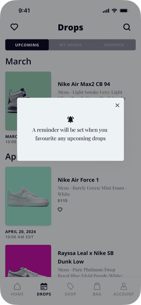
A mobile app that creates a seamless and personalized shopping experience that notifies users of new shoe releases.
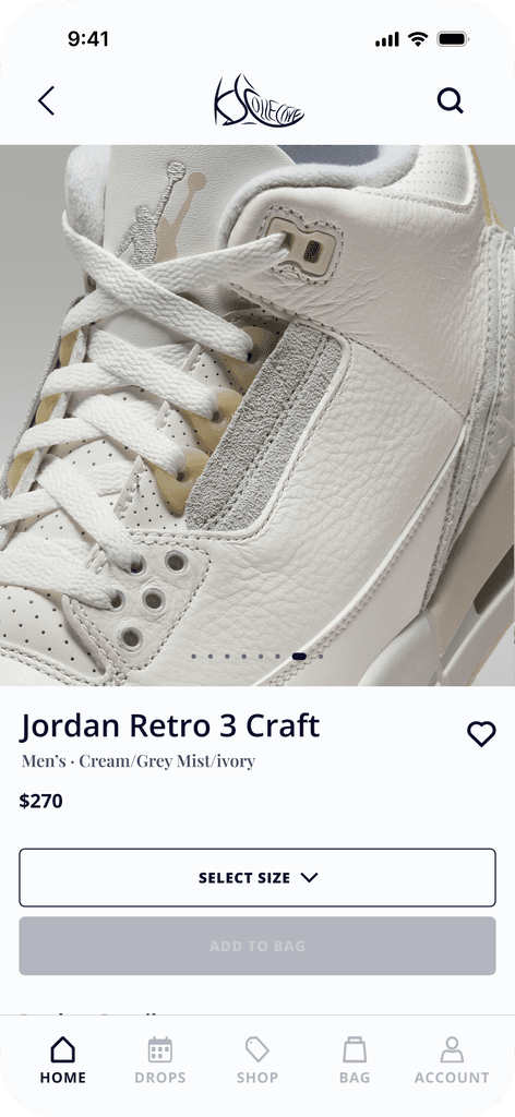
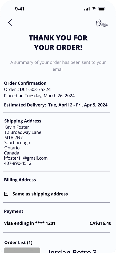
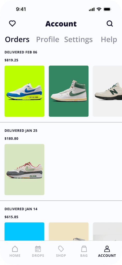
Seamless Experience
The app features intuitive user navigation, detailed product pages with vivid imagery, and online ordering/tracking options.
Personalization
Customizable settings will leverage push notifications, in-app alerts, and activity tracking to inform users of new arrivals, restocks, and promotions.
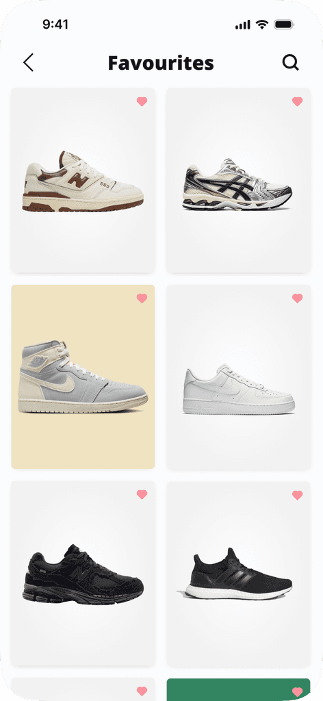
Favourites
Effortlessly bookmark preferred sneakers for future consideration, ensuring swift access to your desired styles at any time.
Here, the outcomes and achievements of the project are highlighted
What I learned
Through this project, one of the most valuable lessons I learned from this project is the importance of user interviews and the wealth of qualitative data that can be gathered simply by speaking to users and asking the right questions.
I realized that direct conversations with users provide rich insights into their behaviors, motivations, and frustrations that may not always be apparent through quantitative data alone.
What I would do differently
Now that I am more familiar and comfortable with conducting user interviews, I would be able to dig deeper during them to uncover insights beyond just surface-level pain points and goals. I would have a better structure for questions to explore users' underlying motivations, habits, and emotions related to their shopping experiences.
Next steps
Moving forward, I would focus on refining the prototype based on the usability insights gathered during testing, particularly improving navigation and personalization features to better meet user expectations. I would also develop a more comprehensive design system to ensure consistency across the app, including typography, colors, and UI components.